
Everest Card
INDUSTRY:
Finance
CLIENT:
Everest Card
YEAR:
2024
EXPERIENCE:
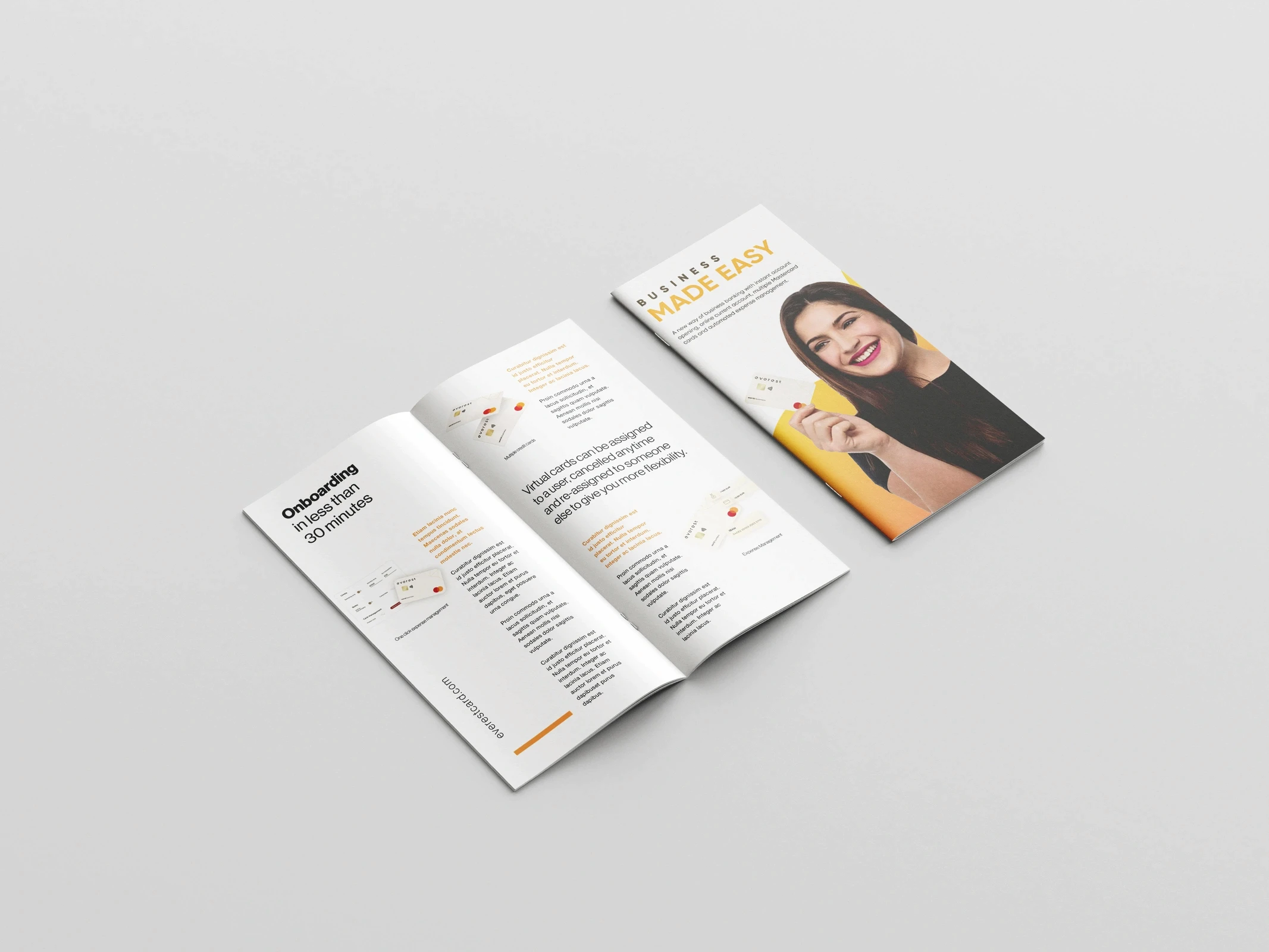
Branding & Identity, Social Media, Brochure, Ads, Motion Graphics, Landing Page, Mobile App
about.
Everest Card provides business payment and financial management solutions tailored to startups and small-to-medium enterprises. The project spanned brand identity, social media design, motion graphics, and digital and print campaigns, covering the full visual communication system across all client touchpoints.
I'll also highlight the inconsistencies and design issues I identified, along with the solutions I developed to address them.

challenge.
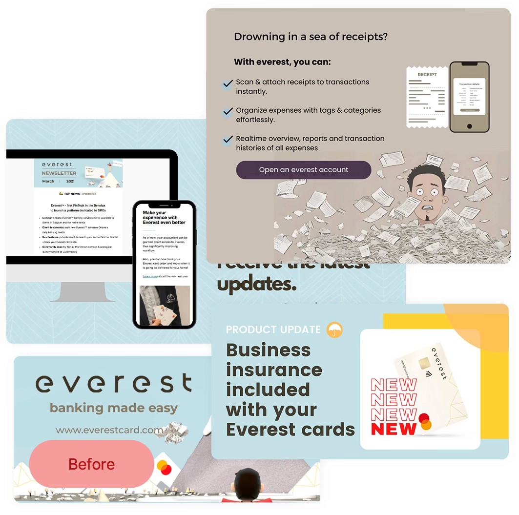
I found the existing design language to be inconsistent, particularly in the use of illustrations, which mixed flat graphics, 3D illustrations, and realistic 3D mock-ups. This inconsistency made the brand feel dated and somewhat generic. On top of that, the visual identity lacked a human element, which made it feel cold and impersonal.
Here are some examples:
process.
For the Everest Card rebrand, I followed a structured design process that combined strategy with execution.
Using Photoshop and Illustrator, I developed the refreshed brand identity and visual assets, while After Effects allowed me to create engaging motion graphics and animations that brought the brand to life.
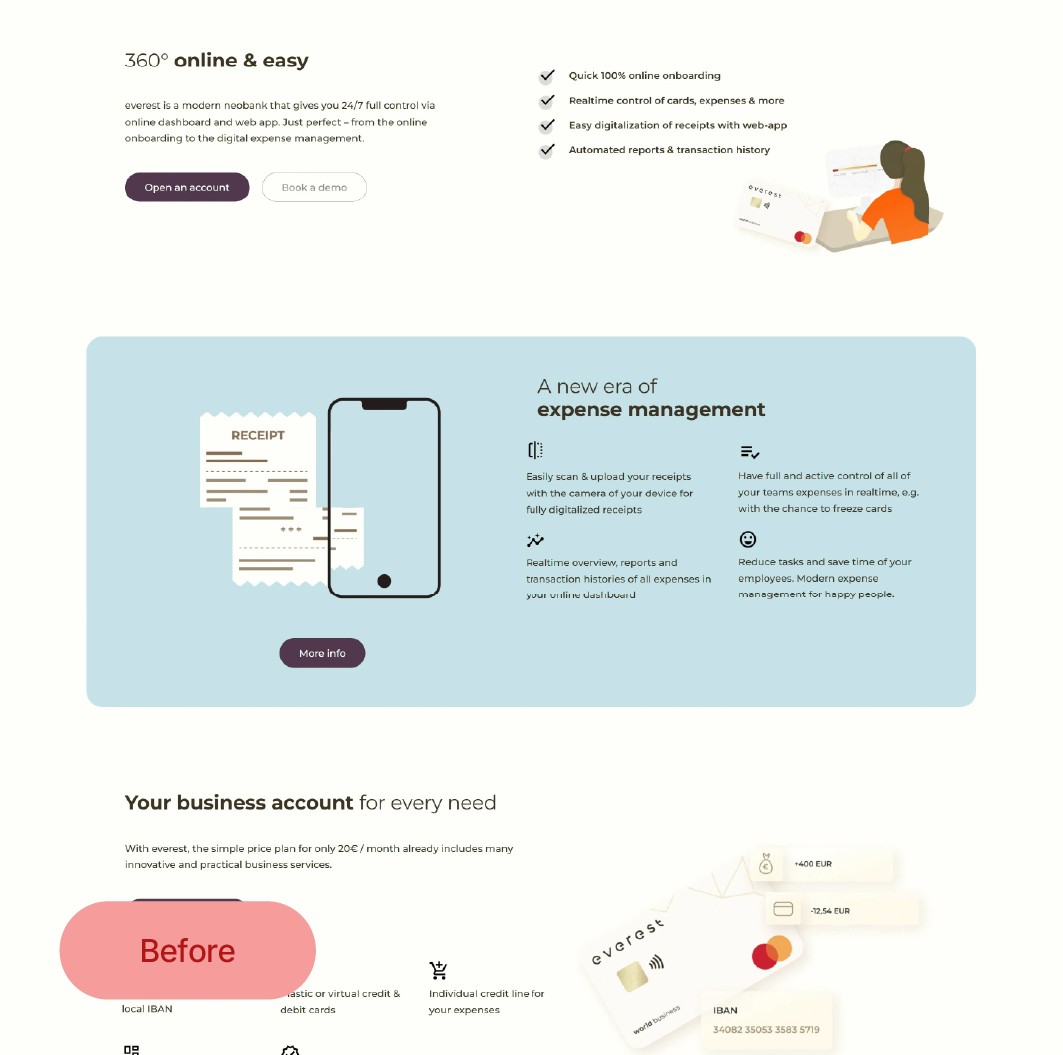
I then used Figma to design and prototype the new website, setting clear limits on the number of colours and fonts to ensure consistency.

results.
The rebrand resolved visual inconsistencies across multiple communication touchpoints, such as website, social media, email, app, print, motion, and ads, replacing a mixed 3D/flat illustration style with a single, cohesive visual language.
The refreshed identity introduced a consistent colour system, typographic hierarchy, and a defined illustration direction, bringing a warmer, more human feel to a brand that previously felt impersonal.


